"It has never been my object to record my dreams, just the determination to realize them." - Man Ray -

19.11.19

Mais Carrapatosos! | New Carrapatosos Book!


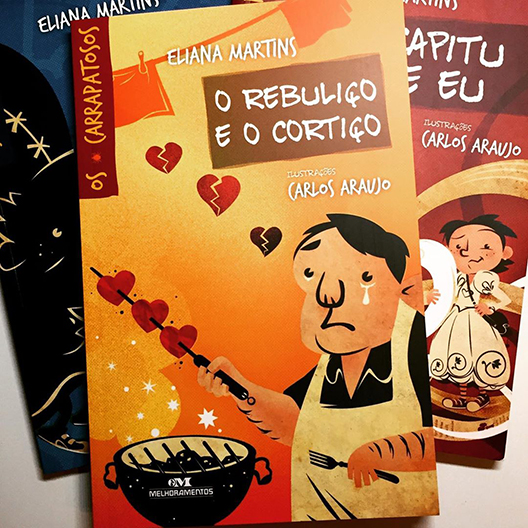
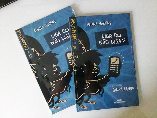
Novo livro da série Os Carrapatosos! Novas aventuras! E vai ficando cada vez melhor...! Escrito por Eliana Martins e ilustrado por mim. Editora Melhoramentos.

Carlos Araujo Ilustrador
Para curtir: Facebook | Para seguir: Twitter | Para ver: Instagram
-------------------------------------------------------------------------------------------
More Carrapatosos! New book! New adventures! Oh, boy! This is my favorite so far...! Written by Eliana Martins and illustrated by Carlos Araujo. Editora Melhoramentos.

More illos: silbachstation.com (in English)

Carlos Araujo Illustrator
Like: Facebook | Follow: Twitter | See: Instagram

Marcadores: , , , , , ,

31.12.18

Best of 2018


Pelos tags desse post, vamos fazer de 2019 um ano ainda melhor! Vejo vocês!

Carlos Araujo Ilustrador
Para curtir: Facebook | Para seguir: Twitter | Para ver: Instagram
-------------------------------------------------------------------------------------------
Considering the tags on this post... Let's make an even better year in 2019...! See you there!

More illos: silbachstation.com (in English)

Carlos Araujo Illustrator
Like: Facebook | Follow: Twitter | See: Instagram

Marcadores: , , , , , , , , , , , , ,

24.9.18

Carlos Araujo Ilustrador | Illustrator

carlos araujo ilustrador

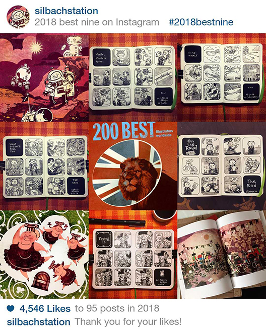
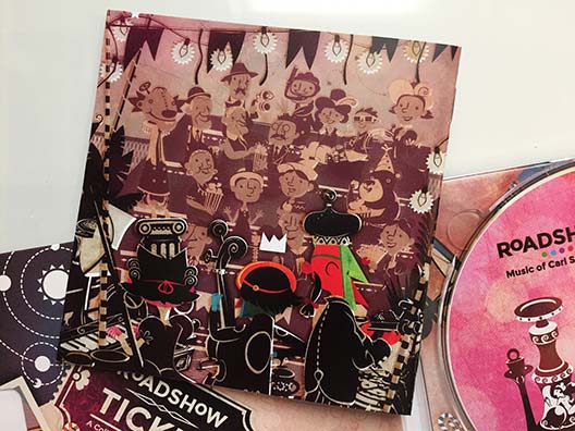
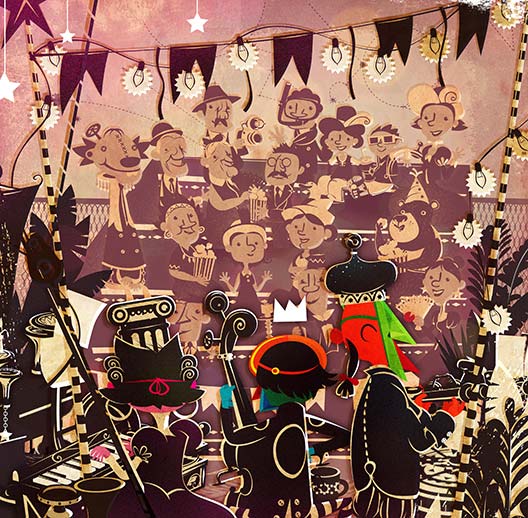
Minha foto estilo 3x3 Carlos Araujo Ilustrador, com alguns destaques como a capa do álbum "Primordial Cordial", o livro "Procura-se Um Amor", meu poster Urban Arts "Yellow Gentleman", os produtos ilustrados para a Colab55: "Cool Walking Life" e "Fantasy Waltz", os ornintorrincos para a Editora Ática e - é claro - a capa de "Roadshow" que agora está no 200 Best Illustrators Worldwide!

Mais ilustras: silbachstation.com (em Português)

Carlos Araujo Ilustrador

Para curtir: Facebook | Para seguir: Twitter | Para ver: Instagram
-------------------------------------------------------------------------------------------
My 3x3 Carlos Araujo Illustrator pic, featuring the "Primordial Cordial" album cover, "Procura-se Um Amor" book cover, my Urban Arts poster "Yellow Gentleman", illustrated products for Colab55: "Cool Walking Life" and "Fantasy Waltz", the playful platypuses for Ática Publishing House and - of course - the "Roadshow" album cover that is now part of the latest 200 Best Illustrators Worldwide edition!

Carlos Araujo Illustrator

More illos: silbachstation.com (in English)

Like: Facebook | Follow: Twitter | See: Instagram

Marcadores: , , , , , , , , , , ,

12.9.18

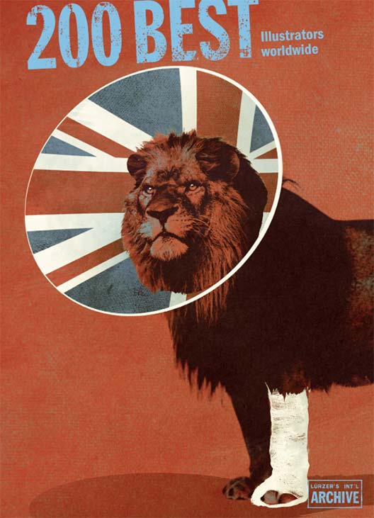
200 Best Illustrators Worldwide 2018 - 2019


Woo-hoo! Estou muito feliz em poder compartilhar essa incrível notícia com vocês: Estou entre os ilustradores escolhidos para fazer parte da mais nova edicão do livro Luerzer’s Archive 200 Best Illustrators Worldwide! É uma grande honra e alegria estra mais uma vez entre essa seleção incrível de ilustradores. Agradeço imensamente ao Júri por terem me incluído na lista... Fiquei extremamanete feliz!

(Acima você confere a belíssima capa do ilustrador Andy Potts.)
-------------------------------------------------------------------------------------------
Hooray! I’m very happy to share this awesome news with you guys: I’m one of the illustrators chosen to be part of the latest Luerzer’s Archive 200 Best Illustrators Worldwide book! It’s an honor for me to once more be among this wonderful selection of illustrators. And I would like to thank the Jury members for selecting me… It made my day!

(Above you can see the gorgeous cover by UK illustrator Andy Potts.)


Os trabalhos incluídos na edição 2018/2019 foram escolhidos por um juri internacional entre mais de 4000 images enviadas de 55 países. A nova edição do 200 Best é uma belíssima coleção de 296 páginas com o melhor da ilustração mundial, apresentando talentos de um total de 34 países.
-------------------------------------------------------------------------------------------
The work featured in this new book was culled by an international jury of 10 from a total 4000+ submissions from 55 countries. The 2018/2019 edition of the 200 Best has turned out to be a beautiful survey comprising 296 pages of the best illustration around, featuring talent from a total of 34 countries.


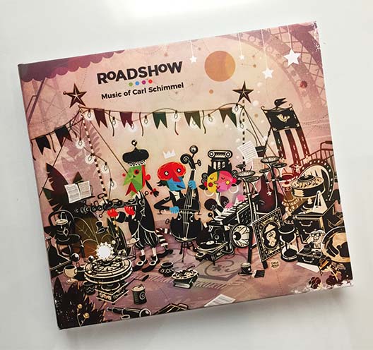
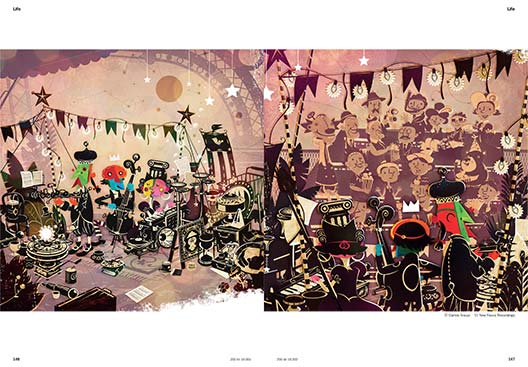
Essa é a quarta vez que estou entre os ilustradores selecionados para o 200 Best Illustrators Worldwide... (veja as edições anteriores aqui, aqui e aqui)...! Dessa vez foram duas ilustrações: Ambas criadas para o álbum Roadshow (Saiba mais sobre o Roadshow aqui). Isso me deixou muito contente não apenas porque eu adorei trabalhar nesse projeto, mas também porque  agora as pessoas poderão ver ambas ilustrações do álbum - capa e contracapa - num tamanho bem maior que o de um livreto de CD... Além disso, estou bem no meio do livro, numa página dupla difícil de passar desapercebida...!
-------------------------------------------------------------------------------------------
This is the fourth time I’m in the 200 Best Illustrators list (see previous editions by clicking here and here and here)…! This time the Jury selected two images: Both are from the Roadshow album booklet (See more about the Roadshow album). This made me very happy not only because I had so much fun working on that project, but also because now the public will be able to see both illustrations - cover and back cover - in a much larger format than a CD booklet. And I’m in the very middle of the book, a double page spread that it will be easy to spot…!


O Luerzer's Archive 200 Best Illustrators Worldwide 2018/2019 está disponível no site.

Clique aqui para ver mais outras capas para álbuns de música.

Mais ilustras: silbachstation.com (em Português)

Para curtir: Facebook | Para seguir: Twitter | Para ver: Instagram
-------------------------------------------------------------------------------------------
Luerzer’s Archive 200 Best Illustrators Worldwide 2018/2019 is now available worldwide. You can order copies here.

Check ou more album covers created by Carlos Araujo by clicking here.

More illos at: silbachstation.com (in English)

Like: Facebook | Follow: Twitter | See: Instagram

Marcadores: , , , , ,

25.10.17

Os Carrapatosos 2 | The Carrapatosos 2


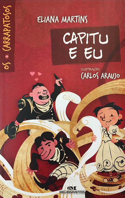
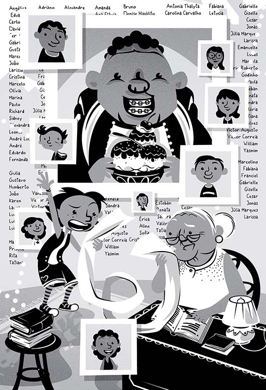
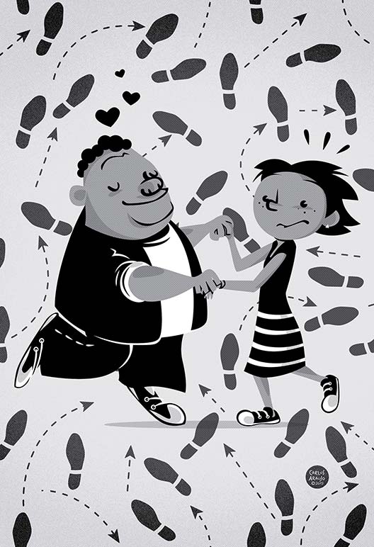
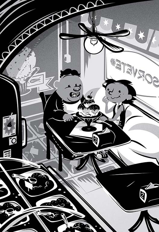
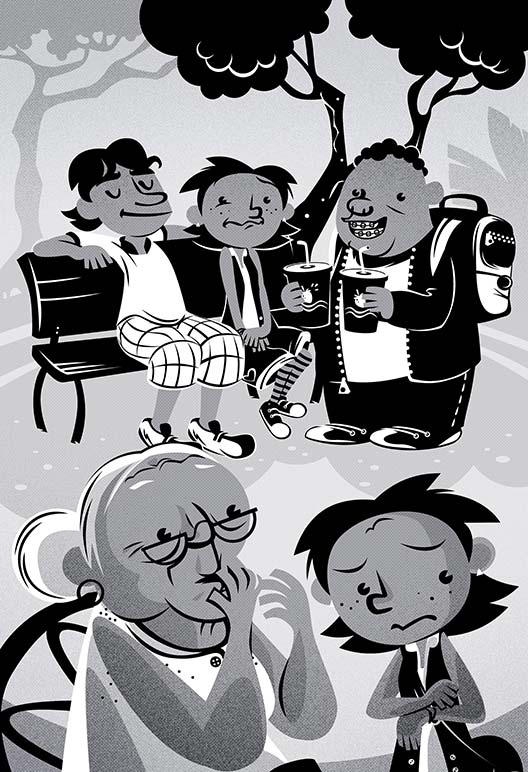
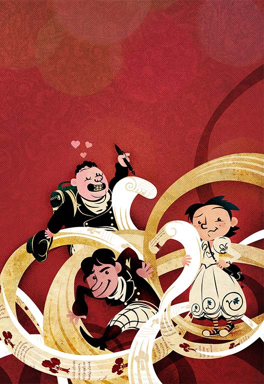
Em 2017 tive a oportunidade de ilustrar mais uma aventura da Família Carrapatoso! O novo livro, “Capitu e Eu”, escrito por Eliana Martins continua as aventuras de Rita, Jorginho, Bodão, Kelly… E a avó Alice continua tentando dar bons conselhos com inspiração em clássicos da literatura. Olha a sinopse abaixo:

“Tudo começou quando Rita Carrapatoso viu o nome de Bodão na lista de convidados da festa aniversário de sua melhor amiga, Kelly, Rita logo soube que teria problemas, ensino ela estava certa!

Bodão, que sempre foi apaixonado por Rita, finalmente conseguiu se aproximar dela e convencê-la de que seria o namorado ideal. Mas esse namoro logo se viu ameaçado por Tales, um dos garotos mais cobiçados da escola. Assim como a Capitu de Dom Casmurro, de Machado de Assis, Rita logo se viu em meio a uma intrincada trama romântica onde dois é bom e três é demais…”

Foi uma alegria enorme ilustrar esse livro! Acredito que “Capitu e Eu” é ainda melhor que o livro anterior “Liga ou Não Liga” ao se aprofundar na relação entre os personagens, em particular Rita e Bodão. Estou ansioso pelos próximos livros…!

-------------------------------------------------------------------------------------------
In 2017 I had the opportunity to create a brand new batch of Illustrations for the Carrapatosos series written by Brazilian author Eliana Martins. The new volume in the series - Capitu and I - continues the adventures of Rita and her friends and their connection to classics of literature.

It was a great experience! I believe the new book is even better than the first one and I’m looking forward to seeing what happens in the future entries in this series…!


Mais ilustras: silbachstation.com (em Português)

Para curtir: Facebook | Para seguir: Twitter | Para ver: Instagram
-------------------------------------------------------------------------------------------
More illos at: silbachstation.com (in English)

Like: Facebook | Follow: Twitter | See: Instagram

Marcadores: , , , , , ,

4.12.14

Ritmos do Brasil: Samba e Bossa Nova


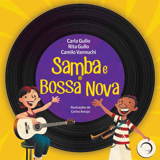
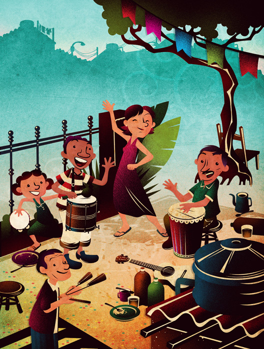
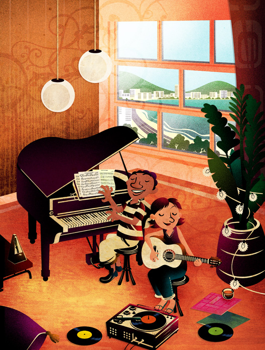
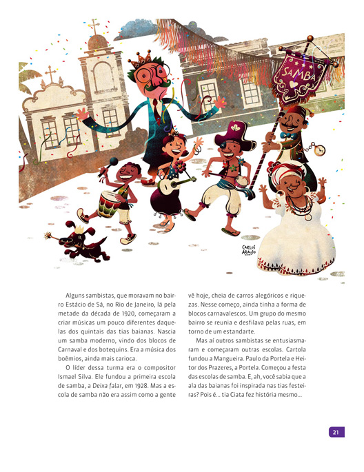
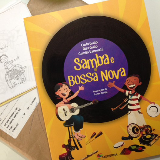
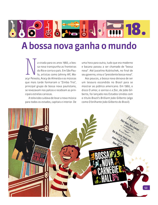
"Ritmos do Brasil" é uma série de livros que contam um pouco sobre a história da música brasileira de uma forma divertida. O primeiro volume "Samba e Bossa Nova", escrito por Carla Gullo, Rita Gullo e Camilo Vannuci, tem ilustrações minhas e aqui você pode ver algumas delas...
-------------------------------------------------------------------------------------------
"Samba and Bossa Nova" is the first volume of a series books that tell us a little bit about Brazilian music. The book - written by Carla Gullo, Rita Gullo and Camilo Vannuci - is illustrated by me and here in this post you can see some of the illos I created.


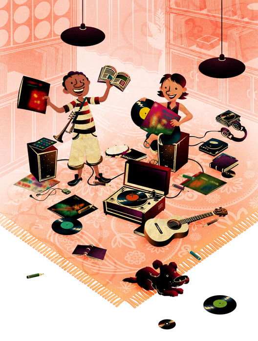
O livro é dividido em duas partes: A primeira conta a história do Samba e a segunda, a história da Bossa Nova. Para amarrar as duas partes e o livro como um todo, tive a idéia de criar esses dois personagens (mais um cachorro, para deixar a coisa toda ainda mais divertida...) e mostrá-los descobrindo as histórias do Samba e da Bossa durante o livro. Imaginei os três encontrando um "tesouro": Uma sala cheia de livros e discos (os inconfundíveis bolachões de vinil) e a partir daí a jornada começa...
-------------------------------------------------------------------------------------------
The book is divided in two parts: The first one is all about Samba e the second one is all Bossa Nova. To create a narrative within the book I decided to create two characters (and a dog, to keep things fun...!) discovering and exploring the world of the Samba and Bossa Nova. I imagined the trio encountering a room full of books and old  - but good - vinyl records... Their journey begins there...


"Ritmos do Brasil: Samba e Bossa Nova" (Editora Moderna, 64 páginas) será lançado esse mês. A editora me enviou uma cópia do livro e o resultado ficou belíssimo...! Poder trabalhar num projeto muito bacana como esse foi um desafio divertido e também uma grande oportunidade de aprender um pouco sobre o tema... Espero que os leitores curtam o livro também!

Ah, o livro já tem uma página Facebook também! Olha lá...!

Mais ilustras: silbachstation.com (em Português)

Para curtir: Facebook | Para seguir: Twitter | Para ver: Flickr
-------------------------------------------------------------------------------------------
"Samba and Bossa Nova" (Moderna, 64 pages) will be launched in Brazil this month. The publisher sent a copy of the book and it looks incredible. Working on this project was challenging and a lot of  fun and I hope readers will enjoy the book!

Oh, you can visit the Facebook page of the book. Check it out!

More illos at: silbachstation.com (in English)

Like: Facebook | Follow: Twitter | See: Flickr

Marcadores: , , , ,

11.11.14

Os Carrapatosos: Os Personagens da Série | The Carrapatosos: Main Characters


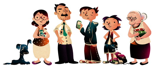
Essa é a família Carrapatoso, os protagonistas da série de livros "Os Carrapatosos" (Editora Melhoramentos), cujo primeiro volume "Liga ou Não Liga?" foi lançado este ano. Escrito por Eliana Martins, a série apresenta histórias, narradas por Rita Carrapatoso, a filha mais nova, que envolvem autores e personagens dos livros clássicos (nesse caso, o Corcunda de Notre Dame) e o cotidiano da família Carrapatoso.

As ilustrações do livro são todas em preto e branco, mas acima apresento uma "rara" versão colorida dos personagens: Tchibum, a mãe Arlene, o pai Luís, Jorginho, Rita e a avó Alice. Originalmente esse "line up" foi concebido para apresentar os personagens na quarta-capa, mas essa idéia acabou não acontecendo.
-------------------------------------------------------------------------------------------
Why, Hello...! This is the Carrapatoso family, the main characters of the book series "The Carrapatosos" (Published in Brazil by Melhoramentos). Written by Eliana Martins and illustrated by me, the book is a story - about family tragicomic situations and classics of literature (in this case, the Hunchback of Notre Dame) - told from the point of view of the spunky and lovely younger daughter Rita Carrapatoso.

The illustrations in the book were created in black and white but here I can show you a "rare" full-color version of the characters: The dog Splash, the mother Arlene, father Luis, Jorginho, Rita and grandma Alice. This "line up" was originally intended to be in the back cover but the idea was scraped. 


Ao criar o design da Família Carrapatoso dois aspectos me serviram de guia: Primeiro, meu objetivo era criar personagem que pudessem dialogar e enriquecer o texto original. Fui anotando os pequenos detalhes - uma breve descrição numa página, um comentário bem humorado em outra - para, a partir deles construir cada personagem. Em segundo lugar, o personagem não deveria apenas possuir um visual que parecesse correto, mas que também pudesse combinar e articular com o visual dos demais personagens (membros da familia e amigos).

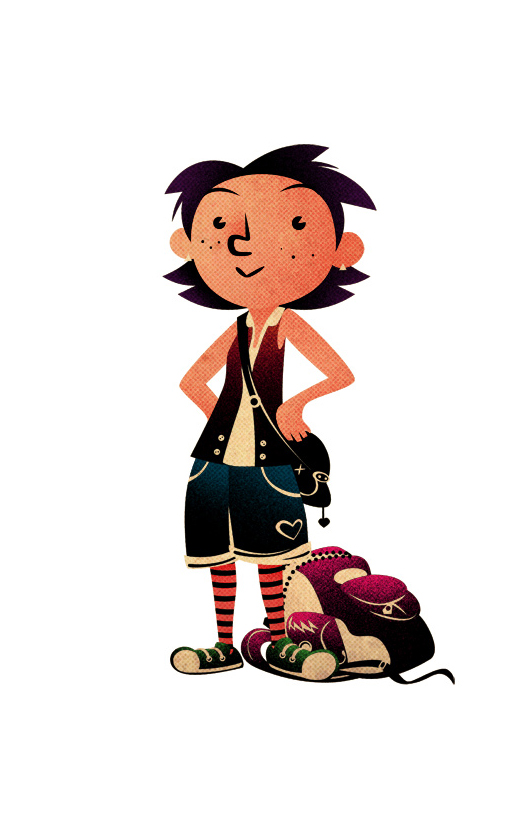
Rita Carrapatoso: É a personagem que usei como eixo para definir todos os outros. Para Rita, optei em criar um estilo próprio, "só dela", pois me parece um personagem de pensamento independente, muita personalidade e grande imaginação. Ela, quando comparada aos demais, estaria quase "fora da curva" no que se refere ao modo de vestir e postura.
-------------------------------------------------------------------------------------------
When working on the characters design my two main goals were: To create characters that could enrich the original text. And to give to each member of the Carrapatoso family the - just right - design that could inform their personalities and bring them visually to life.

Rita Carrapatoso: She is the narrator of the series. She is a plucky young girl with lots of personality and imagination. I wanted her to have a distinct look, different - but not too outrageous - when compared with the rest of her family.


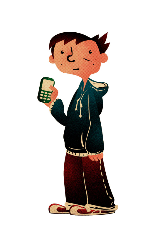
Jorginho: É importante que quando vemos Jorginho e Rita lado a lado, além do fato de serem irmãos esteja claro, as personalidades também possuam uma articulação: Jorginho é descrito como "sempre atrasado" e, pelo texto, Rita possui uma agilidade mental maior do que seu irmão mais velho. Para Jorginho criei um visual próximo ao arquétipo do adolescente desajeitado, de ombros caídos e ligeiramente corcunda (essa última característica reforçada pelo capuz do casaco nas costas).
-------------------------------------------------------------------------------------------
Jorginho: Rita's older brother. He is described by his sister as a "sluggish" guy... I took this description and went with this look of a awkward teen with  slightly large clothes.


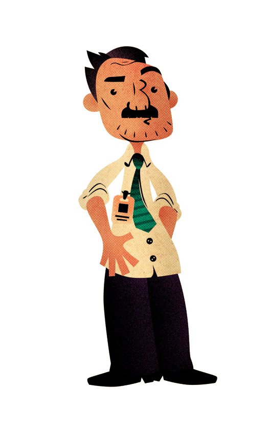
Luís: Para encontrar uma dinâmica para os personagens Arlene e Luís, usei como referência a cena onde Luís relembra como conheceu Arlene. Busquei criar um casal que pudesse se parecer ao máximo com a idéia de "feitos um para o outro" ou, melhor ainda, que se complementassem.
-------------------------------------------------------------------------------------------
Luis: The hardworking, stern but loving father. To me it was important that Luis and his wife (Arlene) to have a "made to each other" look and feel...


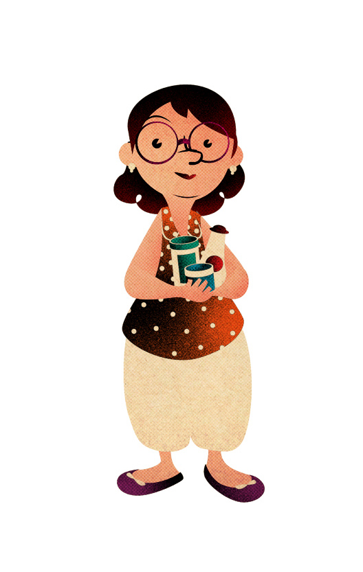
Arlene: Além disso, era importante que pudéssemos identificar os traços dos pais nos traços dos filhos...!
-------------------------------------------------------------------------------------------
Arlene: She is a saleswoman and a slightly distracted mother.  When put beside her husband you can notice how the parents and their kids look like each other.


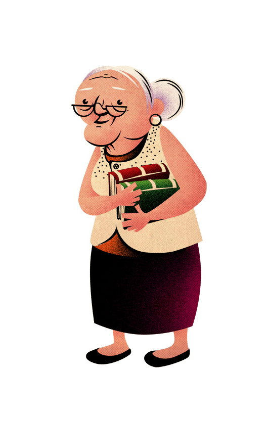
Alice: A avó de Rita e Jorginho é descrita como uma pessoa sábia e no texto, me pareceu ser alguém de personalidade tranquila. Dessa forma, busquei um personagem que pudesse incorporar essas características visualmente.
-------------------------------------------------------------------------------------------
Alice: Rita's grandmother. He is described by the author as a wise and educated person. The is very cool and reads a lot (she is always with a book on her hands). She introduces Rita to the rich world of literature and this sparks her granddaughter imagination. 


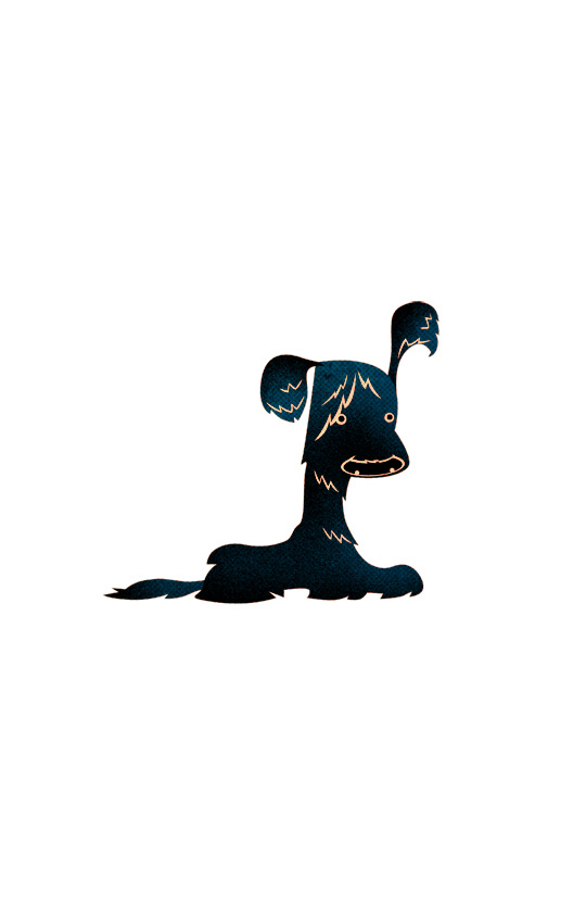
Tchibum, o cachorro: Decidi me guiar pelo nome. Pensei num animal cujo pelo tivesse essa aparência meio desleixada, como se estivesse "molhado". Gostaria de ver o Tchibum mais nos próximos livros...!
-------------------------------------------------------------------------------------------
Splash, the dog: Jorginho's faithful dog. Unfortunately, Splash doesn't appear that much in the book... I only had the name (Tchibum is "Splash" in Portuguese) as a guide to create this disheveled - but adorable - dog.


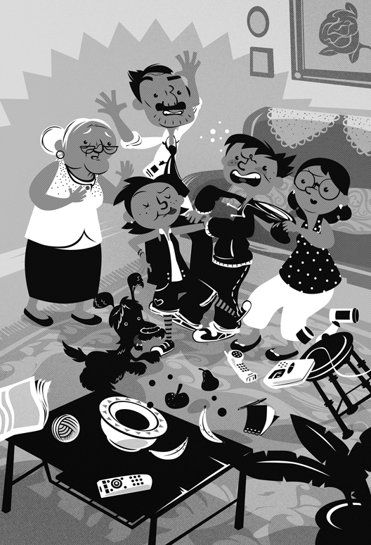
Abaixo, uma das ilustrações do livro... Ah...! Nada como um dia em família...!  Saiba mais sobre "Os Carrapatosos". "Liga ou Não Liga", de Eliane Marins (Editora Melhoramentos, 88 páginas) já está disponível nas livrarias.

Mais ilustras: silbachstation.com (em Português)

Para curtir: Facebook | Para seguir: Twitter | Para ver: Flickr
-------------------------------------------------------------------------------------------
Bellow, one of the chapter illustrations... Ah...! There is nothing like family...!

See more about The Carrapatosos.


More illos at: silbachstation.com (in English)

Like: Facebook | Follow: Twitter | See: Flickr

Marcadores: , , , , ,

5.11.14

Os Carrapatosos | The Carrapatosos


Já está disponível o o primeiro livro da série "Os Carrapatosos": "Liga ou Não Liga?" da autora Eliana Martins. São histórias, narradas por Rita Carrapatoso, a filha mais nova, que envolvem autores e personagens dos livros clássicos (nesse caso, o Corcunda de Notre Dame) e o cotidiano da família Carrapatoso.

A descrição trama de "Liga ou Não Liga" (do site da Editora Melhoramentos):

"Alguma coisa estava errada. Jorginho vivia calado, ensimesmado e bastante misterioso. Seu comportamento atípico começava a intrigar a família Carrapatoso.

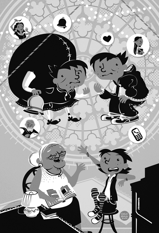
Mas o que poderia estar acontecendo com Jorginho? Estaria apaixonado por alguém do colégio? Quando sua irmã, Rita, decide investigar o caso, acaba tornando-se o cupido de uma história de amor. Para ajudar o irmão, Rita conta com a avó Alice, experiente leitora que se baseia na obra O Corcunda de Notre Dame, de Victor Hugo, para falar das coisas do coração.

No final das contas, será que Jorginho conseguirá vencer o medo e a timidez e transformar seu amor platônico em realidade?"

Abaixo algumas das artes que criei para o livro...
-------------------------------------------------------------------------------------------
This is the first book of a new series titled "The Carrapatosos", published in Brazil by Melhoramentos. Written by Eliana Martins and illustrated by me, the book is a story - about family tragicomic situations and classics of literature (in this case, the Hunchback of Notre Dame) - told from the point of view of the spunky and lovely younger daughter Rita Carrapatoso.

The plot (as presented by the publisher):

"Something is wrong. Jorginho is unusually quiet and introspective. His antics were starting to get on the Carrapatoso family nerves.

But what could the reason behind Jorginho's mysterious behaviour? Do he have a crush on someone at school? When his younger sister - Rita - decides to take matters into her own hands she inadvertently takes the role of the Cupid in a unsuspected love story. To help her big brother, Rita seeks the wisdom of her grandmother Alice. The old woman is a wise and avid reader that uses the Hunchback of Notre Dame story by Victor Hugo as a way to explain to her granddaughter the matters of the heart.

But when all is said and done, will Jorginho overcome his shyness and fear of rejection to be able to turn his platonic love into a real one?" 

Bellow you can check some of the illustrations created for the book.


Trabalhar nesse projeto foi incrível, tive muita liberdade para criar em cima do texto e "dar uma cara" para os personagens. Ao criar o design da Família Carrapatoso, dois aspectos me serviram de guia: Primeiro, meu objetivo era criar personagens que pudessem dialogar e enriquecer o texto original. Fui anotando os pequenos detalhes - uma breve descrição numa página, um comentário bem humorado em outra - para, a partir deles construir cada personagem. Em segundo lugar, o personagem não deveria apenas possuir um visual que parecesse correto, mas que também pudesse combinar e articular com o visual dos demais personagens (membros da família e amigos).
-------------------------------------------------------------------------------------------
Being able to illustrate this project was an incredible experience as I had total freedom to create from the story by Eliana Martins and give each character a face and a distinct visual. When working on the characters design my two main goals were: To create characters that could enrich the original text. And to give to each member of the Carrapatoso family the - just right - design that could inform their personalities and bring them visually to life.


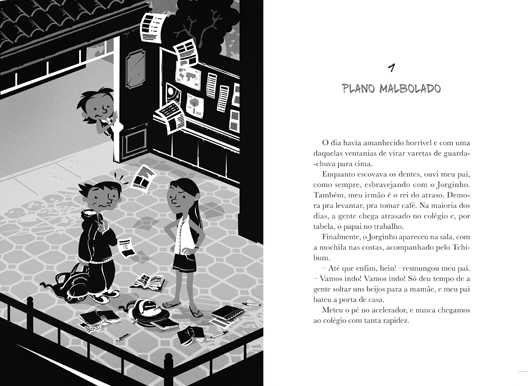
Outra característica desse projeto é que foi necessário criar as ilustrações do interior do livro todas sem o auxílio de cores. Foi uma grande oportunidade explorar as possibilidades de criar cada cena sem o apoio usual de cores e texturas que podem ser vistas em outros trabalhos meus. Deixaram as artes com um jeitão "unplugged", sei lá...!
-------------------------------------------------------------------------------------------
Another unusual thing... Since the book is printed in black and white, all illustrations were grayscale. I saw it as a great opportunity to explore the possibilities of creating each scene without the familiar support that comes from using colors and textures. In the end each illo shows this "unplugged" vibe that I really like...!


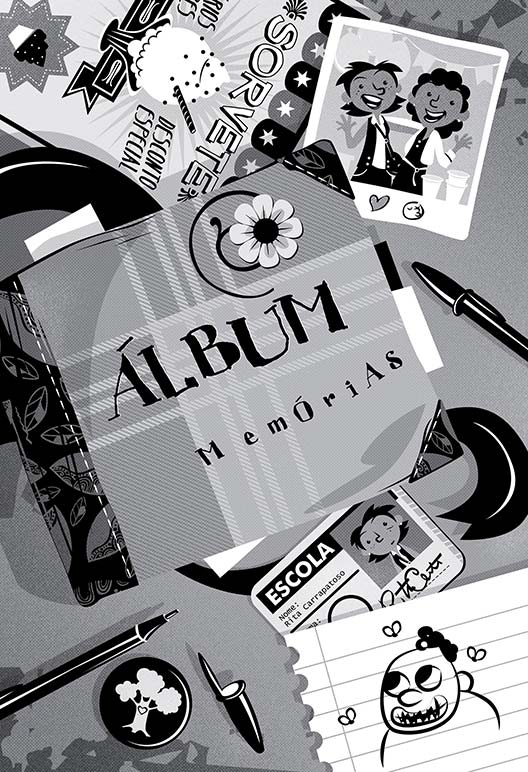
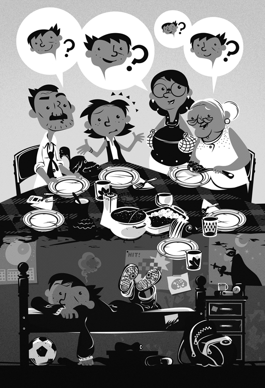
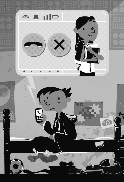
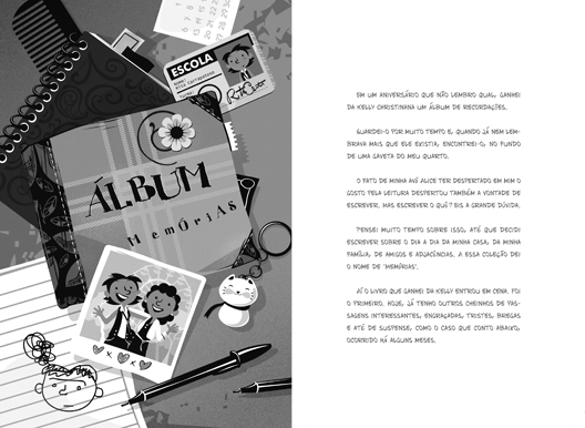
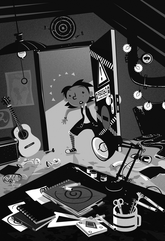
Cada história na série "Os Carrapatosos" é tirada do álbum de recordações da personagem Rita. Foi uma diversão sem fim criar os pequenos detalhes de cada cena...! Por exemplo, o quarto misteriosos com todos os objetos espalhados, os posters na parede e os objetos debaixo da cama, a carteirinha da escola, a foto da Rita com a melhor amiga na frente da roda gigante...
-------------------------------------------------------------------------------------------
Each story of  "The Carrapatosos" series are actually the annotations made by the character Rita in her memory book. I had so much fun creating the small details in each scene: The "room of doom" with all the objects scattered, the posters on the wall, the objects under the bed, Rita's school ID card, the photo of Rita and her best friend hanging out...


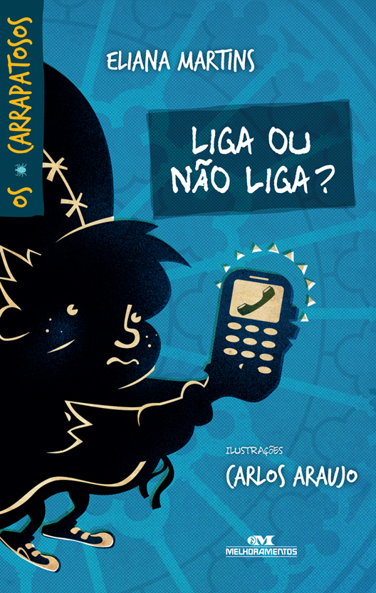
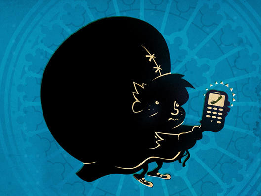
Para encerrar, a imagem em destaque no portfolio e capa do livro. Uma imagem dupla que envolve todo o livro. A orientação era criar uma capa que fosse algo misteriosa, testei várias possibilidades até sugerir essa solução usando a silhueta do Jorginho transformado em corcunda. Se ele vai ligar ou não para a garota que ele gosta o leitor só vai saber depois de terminar o livro.

"Liga ou Não Liga?" (Editora Melhoramentos, 88 páginas) já pode ser encontrado nas livrarias...!
-------------------------------------------------------------------------------------------
Last but not least, you can see bellow the full illustration for the cover. A wraparound cover featuring the character Jorginho transformed in a hunchback (as he deals with his fear of rejection). Will he finally call the girl he loves...? Let the reader find the answer (of course)... The Carrapatosos are here!


Mais ilustras: silbachstation.com (em Português)

Para curtir: Facebook | Para seguir: Twitter | Para ver: Flickr
-------------------------------------------------------------------------------------------
More illos at: silbachstation.com (in English)

Like: Facebook | Follow: Twitter | See: Flickr

Marcadores: , , , , , ,

7.10.13

Revista Educatrix 5 | Educatrix Magazine #5


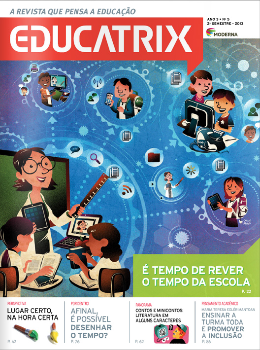
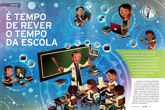
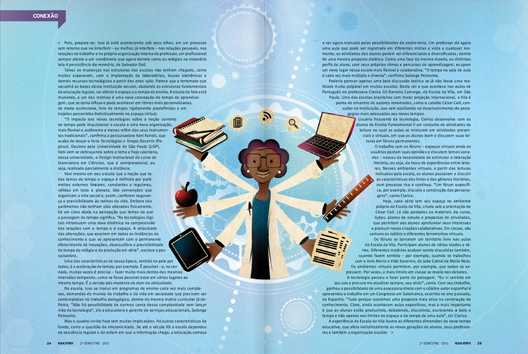
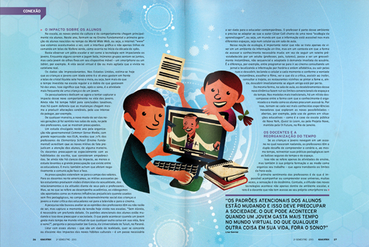
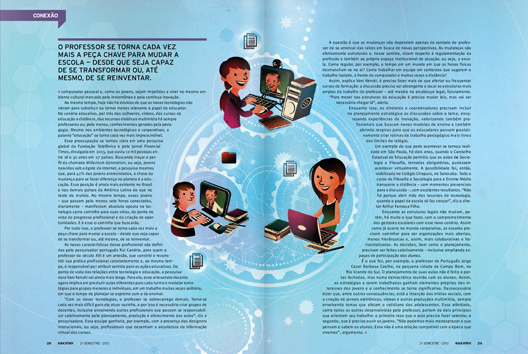
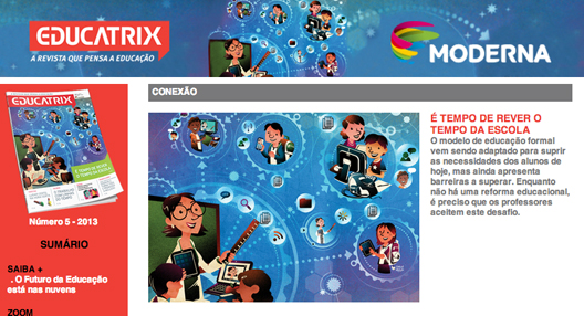
A Revista Educatrix desse mês traz capa e matéria ilustradas por mim: Na página 22 da edição de Outubro temos um artigo muito interessante sobre as mudanças provocadas pela tecnologia - conectividade e interatividade -  na dinâmica do ensino nas escolas. O espaço real e coletivo da sala de aula interage com os espaços virtuais (e individuais) dos alunos criam um novo tempo e uma nova forma de lidar com o tempo dentro e fora das escolas. É claro que há muito mais nas 8 páginas que compõem a matéria... Você pode ler o texto completo no site da Revista Educatrix.
-------------------------------------
This month Educatrix Magazine - A Brazilian magazine about education - features cover and main article illustrated by me: The article tells us about how technology changed the dynamic between teacher and student in the school. The real space and its collective time of the classroom interacts with the virtual space and individual time of each student bringing us a new perception and concept of time inside and outside the traditional space of the school. Of course there much more than that... You can find the complete article (in Portuguese) at Educatrix Magazine.


É claro que há muito mais nas 8 páginas que compõem a matéria... Você pode ler o texto completo no site da Revista Educatrix.

Mais ilustras: silbachstation.com (em Português)
-------------------------------------
Of course there much more than that... You can find the complete article (in Portuguese) at Educatrix Magazine.

More illos at: silbachstation.com (in English)


Para curtir: Facebook | Para seguir: Twitter | Para ver: Flickr
-------------------------------------
Like: Facebook | Follow: Twitter | See: Flickr

Marcadores: , , , , , , ,

4.9.13

Latin American Ilustración 2 Winner!


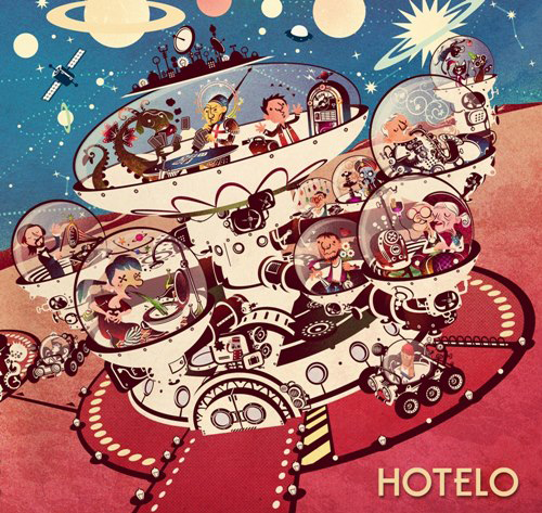
Notícia boa! Meu trabalho "Hotel Espacial" - criado para a capa do CD da banda Hotelo - foi selecionado para fazer parte da AI-AP Latin American Ilustración 2! De 431 imagens inscritas, apenas 29 imagens foram selecionadas para representar o melhor da América Latina em 2013...!
-------------------------------------
More awesome news! My work "Space Hotel" - created for Brazilian rock band Hotelo debut album -  was selected to be part of 2013 AI-AP Latin American Ilustración 2! From 431 images, only 29 were selected to represent the best images from Latin America…!


As 29 imagens selecionadas serão apresentadas em Nova York durante o mês de Novembro, em dois eventos: BIG TALK (no dia 6), um simpósio com os jurados desse ano e THE PARTY (no dia 7) onde haverá muita celebração e regozijo. U-hu!

Para conhecer mais sobre "Hotel Espacial", o meu trabalho selecionado para a Latin American Ilustración 2, clique aqui.

Mais ilustras: silbachstation.com (em Português)

Para curtir: Facebook | Para seguir: Twitter | Para ver: Flickr
-------------------------------------
The 29 selected images will be presented in New York City at two exclusive events that will occur in November: BIG TALK, on November 6th, a symposium with juries from the year's competition. And THE PARTY, November 7th, celebrating the winners... and there will be much rejoicing! Yay!

To see more about "Space Hotel", my work accepted into Latin American Ilustración 2, click here.

More illos at: silbachstation.com (in English)

Like: Facebook | Follow: Twitter | See: Flickr

Marcadores: , , , ,

15.7.13

Spotlight: Primordial Cordial


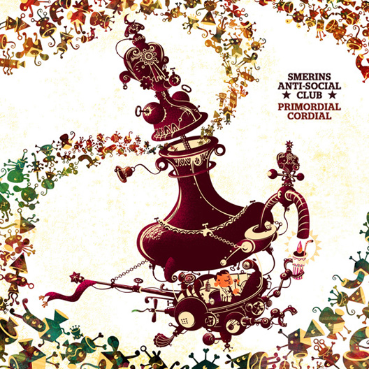
Primordial Cordial: O novo CD da banda inglesa Smerin's Anti Social Club foi lançado oficialmente no mês anterior e já pode ser encontrado na Amazon e na Loja iTunes (ou você pode comprar diretamente no site da banda). O disco é mesmo incrível e cheio de energia e ótimas músicas...! E - é claro! - tem essa capa... Foi uma ótima experiência criar a arte para a capa de Primordial Cordial e nesse post compartilho alguns detalhes sobre o projeto...
-------------------------------------
Primordial Cordial: The new album from UK based Smerin's Anti Social Club was officially launched last month and is now available through sellers like Amazon and iTunes Store (or you can grab it at the band's web site). This is a truly awesome album, full of energy and great songs...! And - of course! - there is the album cover... I had a blast creating the artwork for the Primordial Cordial album! Let me share a little more about this project...


Quando a banda me procurou para criar a arte do que seria seu próximo album, eu nem sabia o que era um cordial... Eles me contaram um pouco a respeito do título e sobre o que eles esperavam da imagem da capa: "Estamos a procura de algo chamativo, divertido, diferente (...) Temos algumas idéias bem específicas (...) mas estamos abertos à sua interpretação e imaginação, desde que a proposta faça referência ao título do album."

Para dos membros da Smerin's Anti Social Club o título - Primordial Cordial - inspira "imagens de organismos simples, elos-perdidos, espécies intermediárias na evolução e protótipos genéticos não tão bem sucedidos e tudo isso de alguma forma combinado com uma fantástica bebida com muito açucar, cheia de aditivos e provavelmente vendida à crianças." Um ótimo ponto de partida, sem dúvida...!
-------------------------------------
When the band approached me asking for a artwork for their next album I didn't know even what a "cordial" was... They told me a little bit about the title and their expectations: "we are after something quirky, funny, bold (...) We have a couple of fairly specific concept ideas (...) although we would be equally open to something straight from your imagination, as long as it makes some reference to the album title."

For the members of Smerin's Anti Social Club, the album title - Primordial Cordial - evoked "Images of simple organisms, missing links, half-formed species and failed genetic prototypes, somehow combined with a fantasy mass-produced ultra-sugary drink, high in additives and probably marketed to kids." That was a good starting point… ! 


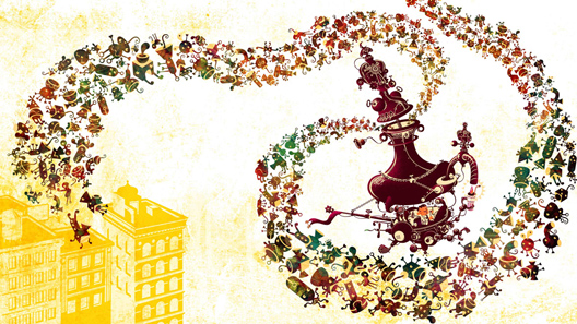
O conceito apresentado oferecia um grande quantidade de idéias e possibilidades: Ciência, criatividade, a tentativa de se combinar diferentes elementos em busca de criar algo artístico, formas de vida simples, o caldo primordial, abiogênese... Tentei encaixar tudo isso numa imagem que (espero) seja coerente e chamativa. Pensei numa máquina que cria a bebida "Primordial Cordial" e a coloquei no centro do palco, ou melhor, da capa. A Máquina captura essas pequenas criaturas flutuantes (que chamei de "Primordiais") e as transforma em bebida.

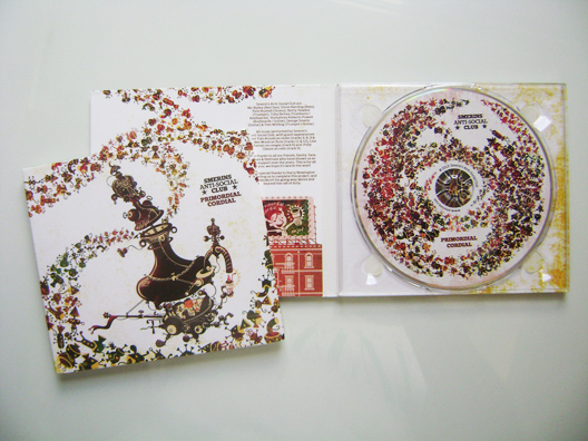
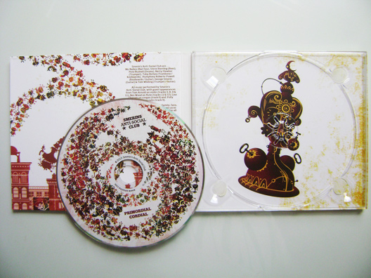
A arte foi criada para um tipo de embalagem chamado de 4-panel digipak: Uma peça única de papel cartão que envolve a peça de plástico que recebe o CD. Abre como se fosse um livro (e é uma ótima alternativa às tradicionais caixas de plástico, também chamadas de "jewel case"). Por isso, a imagem deveria ser uma peça única também, para encaixar com perfeição no template da digipak e se transformar na capa, contracapa e arte interna do álbum. Veja a baixo a arte completa.
-------------------------------------
The concept offered a lot of interesting and inspiring ideas: science, creativity, trying to combine different elements to create something artistic, basic life forms, primordial ooze, abiogenesis… I tried to fit them in some (hopefully) coherent and eye catching image. I thought about a machine that creates the "Primordial Cordial" drink and put it in the center of the stage: The front cover itself. The Machine captures these little floating creatures (I call them "Primordials") and turns them into drink.

The album artwork was created for a 4-panel digipak: A one-piece, sturdy board package encasing a plastic disc tray. It unfolds like a small book or album. That meant I had to create a single artwork that would be later turned into the front and back covers and the internal art. Bellow the complete image ready to be applied to the digipak template.
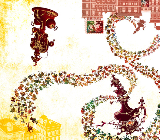


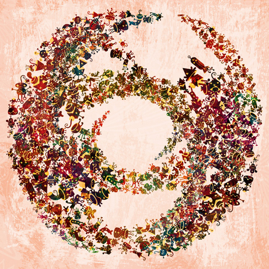
Também criei a arte para o label do CD. Para mim era muito importante que essa arte se comunicasse bem com o conceito e visual das capas e artes internas. Imaginei nessa "visão de cima" de um recipiente cheio de Primordiais se misturando, sugerindo um líquido (o cordial do título) ou uma espiada dentro da Máquina.
-------------------------------------
I also created the artwork for the CD label. To me it was very important that the CD label image should complement the look and feel of the entire package. I imagined this top view of a cup full of Primordials in a twirl, suggesting a liquid (the cordial itself) or a look inside the Machine.


Abaixo, a arte criada para o label do CD, com espaços para o nome da banda, título do álbum e outras informações (como a marca Compact Disc, por exemplo). A imagem tem um jeitão semelhante ao do símbolo Yin-Yang, o que achei bastante apropriado...
-------------------------------------
Bellow the artwork for the CD label with some space for the band's name and info (like the Compact Disk logo for example). The artwork has a kind of Yin-Yang symbol vibe that I thought to be quite suitable...


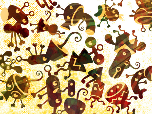
As formas dos Primordiais são inspiradas em formas de vida primitivas e em brinquedos de montar. Cada Primordial é formado por partes menores que representam diferentes elementos que flutuam ao redor quando um processo criativo está acontecendo: Inspiração, serendipidade, diferentes combinações de idéias, tentativa-e-erro, enfim... Criei mais de 50 Primordiais únicos e cada um deles em, pelo menos, três diferentes poses.
-------------------------------------
The "Primordials" shapes are inspired by the look of basic life forms and connecting pieces toys. They are made of even smaller parts and represent the different elements that floats around when creative activity is going on. They represent inspiration, serendipity, different combinations of ideas, trying-and-error, etc… The "Primordials" are seen floating around, coming from everywhere. I made more than 50 unique Primordials and each one shows up in at least three different poses.


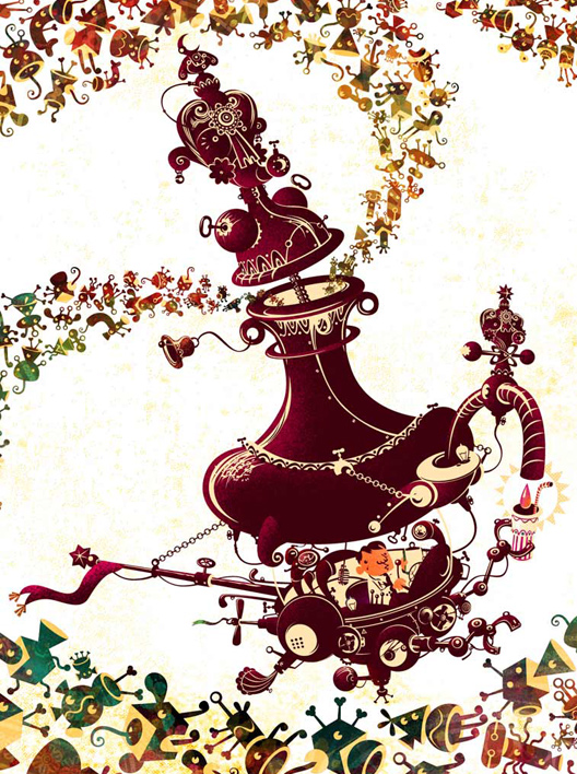
O design da Máquina de Fazer Cordial é uma combinação de antigas máquinas de bebida com uma garrafa de gênio, ornamentada e operada por um personagem com cara de cientista. Também busquei dar à Máquina um visual reminescente a de um totem (Totens representam a mente coletiva ou o inconsciente coletivo e costuma estar associado à ancestrais primordiais e não-humanos). É parte mágica, parte ficção científica. Uma máquina saturada de noções muito humanas.

Foi muito divertido trabalhar nesse projeto e descobrir o mundo e a música de Smerin's Anti Social Club! Meu agradecimento à todos os membros da banda por essa incrível oportunidade...
-------------------------------------
The design of the Cordial-maker Machine is a mix of old drink machines and genie bootle, with lots of ornaments, operated by a scientist-like character. I also wanted to give the Machine a totem-like visual (Totems represents the collective mind or collective unconscious and sometimes even a primordial non-human ancestor). Its part magic, part science fiction. A machine that is also entangled with very human notions.

I had a great time creating this artwork and discovering the world and sound of Smerin's Anti Social Club! My thanks for the band for this wonderful opportunity...


Primordial: adj m+f (primórdio+al3) 1 Relativo a primórdio. 2 Que existe desde o começo; originário, primeiro, primitivo.

Cordial: adj m+f (lat cordiale) 1 Relativo ao coração. 2 Afetuoso, franco, sincero. 3 Que estimula o coração. 4 Estimulante, vigorante. sm 1 Estimulante cardíaco. 2 Medicamento, bebida ou comida estimulantes ou vigorantes.
Veja também a camiseta do Smerin's Anti Social Club: Primordial Cordial.

E se você gostou desse trabalho, não deixe de ver o post sobre minhas ilustrações para o CD de estréia da banda Hotelo.

Mais ilustras: silbachstation.com (em Português)

Para curtir: Facebook
Para seguir: Twitter
Para ver: Flickr
-------------------------------------
Primordial: adj. 1 existing at or from the beginning of the world (SYN: primeval) 2 (of a feeling or desire) very basic.

Cordial: noun. 1 (BrE) a sweet drink that does not contain alcohol, made from fruit juice. It is drunk with water added: blackcurrant cordial. 2 a glass of cordial.

See the Smerin's Anti Social Club: Primordial Cordial T-Shirt.

If you liked this CD artwork, be sure to check my illustrations for the Brazilian band Hotelo debut album.

More illos at: silbachstation.com (in English)

Like: Facebook
Follow: Twitter
See: Flickr

Marcadores: , , , , , ,

Home  |  Mais Antigos/Older Posts